The Changelog
What's new around here?
Succinct and informative updates about Flux.
August 10, 2026
Toggle
Version ^2.17.0

Flux now ships with a Toggle component: a compact, button-shaped control for turning settings and modes on or off. It's included in the free component set.
Copy to clipboard
<flux:toggle wire:model.live="fastMode" icon="bolt" tooltip="Fast mode" />Tooltips for context
Icon-only controls need a clear name. Add the tooltip prop to give people context on hover and provide an accessible name for screen readers:

Copy to clipboard
<flux:toggle icon="bolt" tooltip="Fast mode" />Custom colors
When the toggle is off, it renders the outline version of your icon. Turn it on and the solid version takes its place in your app's accent color. Use the color prop to customize that active color without changing the control surface:

Copy to clipboard
<flux:toggle icon="bolt" color="blue" checked /><flux:toggle icon="heart" color="red" checked /><flux:toggle icon="bell" color="amber" checked />Adding text
Icon-only is the main use case, but you can add a short visible label when a setting benefits from persistent context. The text stays neutral while the icon carries the active state:

Copy to clipboard
<flux:toggle icon="heart" color="red">Favorite</flux:toggle>
August 9, 2026
Richer select options
Version ^2.16.0
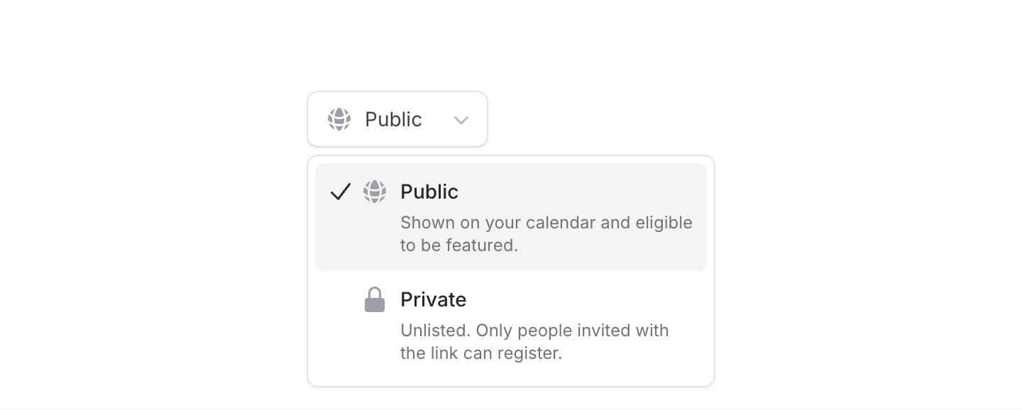
We've made a bunch of improvements to Select. Options can now have icons, descriptions, and avatars, and the dropdown itself can be positioned, aligned, and sized independently from the trigger.
Let's take a look.
Icons and descriptions
Add an icon to make options easier to scan, or a description when a label needs a little more context. You can use either on its own or combine them:
Copy to clipboard
<flux:select variant="listbox"> <flux:select.option value="public" label="Public" icon="globe-alt" /> <flux:select.option value="private" label="Private" description="Only invited users can access this." /></flux:select>Descriptions only appear while the dropdown is open, so the selected value stays nice and compact. Icons also support icon:variant and icon:class for further customization.
Avatars
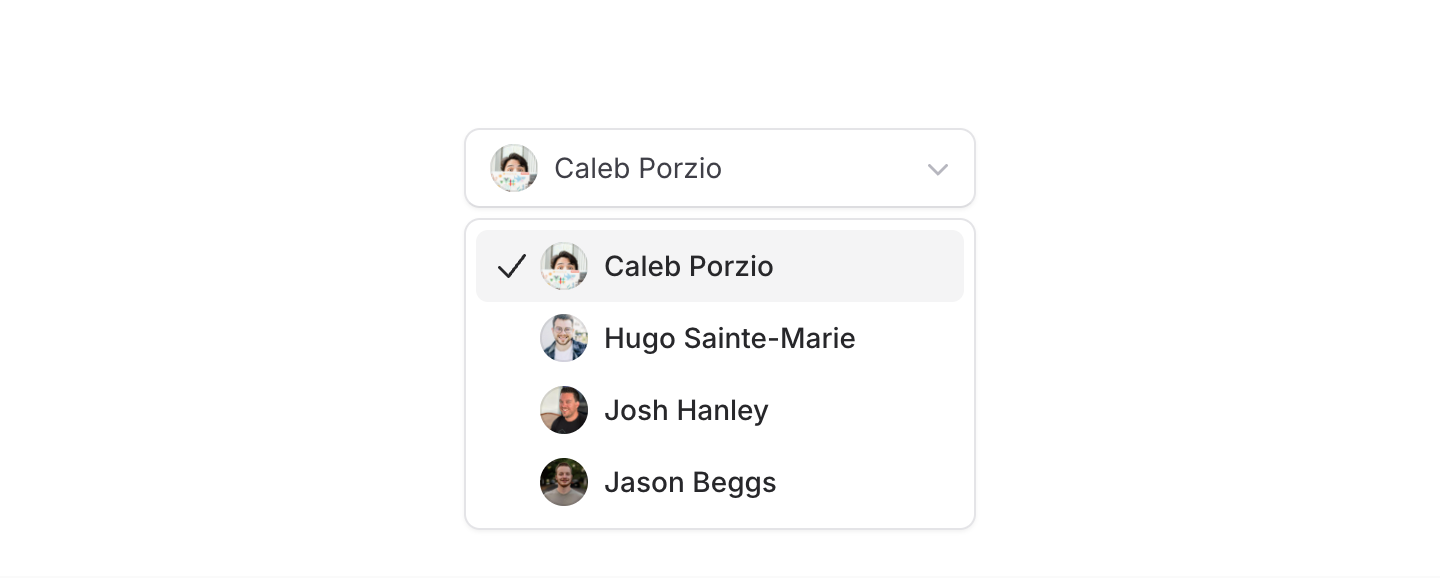
For user pickers, pass an image URL to the new avatar prop:
Copy to clipboard
<flux:select variant="listbox" wire:model="assignee"> <flux:select.option value="caleb" label="Caleb Porzio" avatar="https://unavatar.io/github/calebporzio" /> <!-- ... --></flux:select>You can pass avatar:* props straight through to the underlying Avatar component when you need more control.
Select components are one of the hardest things to get right in a UI kit, and we're proud of how flexible and capable Flux's select has become!
August 8, 2026
Dot ticks for sliders
Version ^2.16.0

Flux sliders can now display dot ticks directly inside the track. They're handy for compact settings, ratings, and other controls with a small set of meaningful steps.
Copy to clipboard
<flux:slider tick:position="inside" min="1" max="5"> @foreach (range(1, 5) as $i) <flux:slider.tick :value="$i" variant="dot" /> @endforeach</flux:slider>The two new options are intentionally independent: tick:position="inside" controls where the slider renders its ticks, while variant="dot" controls how each tick looks.
That means you can mix and match them. Dot ticks can sit below the track, and regular line ticks can sit inside it. Custom tick labels continue to work below the slider as before.
Dots also inherit the slider's active state, so marks over the filled portion of the track automatically adjust their contrast as the value changes.